- 차원(Dimension) vs. 측정값(Measure) 비교,
- 불연속형(Discrete) vs. 연속형 (Continuous) 비교 문제는 단골손님으로 등장
1. In Tableau, a discrete field is shown in which color?
- Blue
Tableau에서 이산 필드(discrete field)는 파란색(blue)으로 표시
2. Which of the following is true for Measures in Tableau?
- Measures contain numeric, quantitative values - Measures
- Measures contain qualitative values (such as names, dates, or geographical data) - Dimensions(차원)
- Measures can be used to categorize, segment, and reveal the details in the data - Dimensions(차원)
- Measures can be aggregated - Measures
- Measures는 주로 숫자형 데이터(정량적 값)를 포함하며, 이를 합계(sum), 평균(average), 최대/최소 등으로 집계(aggregated)할 수 있습니다.
- 반대로 Dimensions(차원)는 주로 범주형 데이터(예: 이름, 날짜, 지역 등)를 포함하며, 데이터를 그룹화하거나 세분화하는 데 사용됩니다.
3. Which of the following are the differences between dimensions and measures?
- Measures contain quantitative values whereas Dimensions contain names, dates or Geographical data
- Measures contain continuous values with green pills whereas dimensions contain discrete values with blue pills.
- Dimensions contain numeric, quantitative values whereas Measures can be used to categorize, segment, and reveal the details in the data Dimensions are aggregated when added to the view, while measures increase the level of detail in the view.
- Dimensions increase the level of detail in the view while measures are aggregated when added to the view.
- Measures contain quantitative values whereas Dimensions contain names, dates or Geographical data
- 정답: ✔️
설명: Measures(측정값)는 주로 정량적(숫자형) 데이터를 포함하며, - Dimensions(차원)는 범주형(이산형) 데이터(예: 이름, 날짜, 지역 등)를 포함합니다.
- 정답: ✔️
- Measures contain continuous values with green pills whereas dimensions contain discrete values with blue pills.
- 정답: ✔️
설명: Tableau에서는 연속형(continuous) 필드는 녹색(green)으로 표시되고, - 이산형(discrete) 필드는 파란색(blue)으로 표시됩니다.
- Measures는 기본적으로 연속형 데이터인 경우가 많습니다.
- 정답: ✔️
- Dimensions contain numeric, quantitative values whereas Measures can be used to categorize, segment, and reveal the details in the data
- 정답: ❌
설명: 반대입니다. - Measures가 주로 정량적 데이터를 포함하고 집계되며,
- Dimensions는 데이터를 분류하거나 세분화하는 데 사용됩니다.
- 정답: ❌
- Dimensions are aggregated when added to the view, while measures increase the level of detail in the view.
- 정답: ❌
설명: 반대입니다. - Measures는 집계(aggregation)될 수 있으며,
- Dimensions는 시각화에 추가될 때 데이터의 세부 수준(Level of Detail)을 높입니다.
- 정답: ❌
- Dimensions increase the level of detail in the view while measures are aggregated when added to the view.
- 정답: ✔️
설명: - Dimensions는 데이터를 그룹화하거나 필터링하여 세부 수준을 높이고,
- Measures는 기본적으로 합계, 평균 등 집계(aggregation) 형태로 표시됩니다.
- 정답: ✔️
-
1. Which of the following is the best reason to use a relationship instead of a join?Answer Provided: 다양한 granularity(세분화 수준)를 가진 테이블을 결합할 때 데이터 중복을 방지하고자 한다.
Correct Answer: You wish to avoid data duplication when combining tables with different granularity
-
2. Relationships are created in which layer?Answer Provided: 논리적 레이어에서 생성
Correct Answer: The logical layer
- 논리적 레이어: Logical Layer
- 물리적 레이어: Physical Layer
- 개념적 레이어: Conceptual Layer
-
3. Which of the following is the best reason to create a saved data source as a .TDS file?
- 다음 중 .TDS 파일로 저장된 데이터 소스를 생성하는 가장 좋은 이유는 무엇인가요?"
-
Answer Provided: "숫자 형식과 정렬 순서와 같은 기본 필드 속성을 저장하고자 한다."Correct Answer: You want to save the default field properties such as number formats and sort order. c
-
4. When creating a union between tables, what will happen if the field names do not match?
- "테이블 간에 유니온을 생성할 때, 필드 이름이 일치하지 않으면 어떻게 되나요?"
-
Answer Provided: "일치하는 필드 이름이 없는 유니온의 필드는 null 값을 포함하게 됩니다."Correct Answer: Fields in the union that do not have matching field names will contain null values.
-
5. In which of the following situations would an outer join be preferred to a blend?
-
"다음 상황 중 아우터 조인(outer join)이 데이터 블렌드(blend)보다 더 적합한 상황은?"
- Answer Provided: "조인 또는 블렌드 기준이 충족되지 않더라도 두 테이블의 모든 행을 포함해야 할 때" 아우터 조인이 데이터 블렌드보다 더 적합합니다.
Correct Answer: when you need to include all rows from both tables, even when the join or blend criteria is not met
-
6. Which of the following uses a primary and secondary data source?
-
"다음 중 기본 데이터 소스와 보조 데이터 소스를 사용하는 것은 무엇인가요?"
-
Answer Provided: "블렌딩"은 기본 데이터 소스와 보조 데이터 소스를 사용하는 방법입니다.Correct Answer: Blending
-
7. Which of the following can be renamed? [select 3]
-
"다음 중 이름을 변경할 수 있는 것은 무엇인가요?"
-
Answer Provided:Correct Answer: Field names, Parameters, Sets
- 필드 이름(Field names): 데이터 필드의 이름을 변경할 수 있습니다. 예를 들어, 데이터베이스의 열 이름이나 보고서의 필드 이름을 더 이해하기 쉬운 이름으로 변경할 수 있습니다.
- 파라미터(Parameters): 파라미터는 사용자 입력을 받는 값이기 때문에, 이름을 변경하여 보다 직관적인 이름을 부여할 수 있습니다.
- 세트(Sets): 세트는 특정 값들의 그룹을 나타내는 객체로, 세트의 이름도 변경할 수 있습니다. 예를 들어, 특정 데이터 집합을 기준으로 세트를 정의하고 그 이름을 사용자가 원하는 대로 변경할 수 있습니다.
-
8. Which of the following can have an alias?
-
"다음 중 별칭(Alias)을 가질 수 있는 것은 무엇인가요?"
-
Answer Provided: "이산 차원의 값"은 별칭(Alias)을 가질 수 있습니다.Correct Answer: Values of a discrete dimension
-
9. Which of the following are predefined geographic roles? [select two]
-
"다음 중 미리 정의된 지리적 역할은 무엇인가요?"
-
Answer Provided:Correct Answer: Airport, Zip code
- "공항(Airport), 우편번호(Zip code)"는 Tableau에서 미리 정의된 지리적 역할입니다.
- 공항(Airport): 공항 코드나 위치 정보를 사용하여 지도에서 공항을 시각화할 수 있습니다.
- 우편번호(Zip code): 우편번호를 사용하여 해당 지역의 경계를 지도에 표시할 수 있습니다.
-
10. Which of the following are default properties which can be assigned to a dimension? [select three]
-
Answer Provided:"다음 중 차원에 할당할 수 있는 기본 속성은 무엇인가요?"
Correct Answer: Shape, Color, Sort -
"모양(Shape), 색상(Color), 정렬(Sort)"은 Tableau에서 차원에 할당할 수 있는 기본 속성입니다.
- 모양(Shape): 각 데이터 포인트를 다른 모양으로 표시할 수 있습니다. 예를 들어, 범주별로 다른 아이콘을 사용하여 데이터를 구분할 수 있습니다.
- 색상(Color): 차원 값에 따라 데이터의 색상을 변경할 수 있습니다. 예를 들어, 범주별로 색상을 달리하여 데이터를 시각적으로 구분할 수 있습니다.
- 정렬(Sort): 차원 값의 순서를 설정할 수 있습니다. 예를 들어, 차원을 알파벳 순서나 값에 따라 오름차순 또는 내림차순으로 정렬할 수 있습니다.
-
11. You have a scatter plot showing sales and profit by product sub-category. You wish to create a set from a cluster of high values sub-categories. What steps should you take?
- "제품 하위 카테고리별로 판매와 이익을 나타내는 산점도가 있고, 높은 값의 하위 카테고리 클러스터에서 집합을 만들고자 한다면, 어떤 단계를 따라야 하나요?"
-
Answer Provided:
Correct Answer: Click and hold down the mouse, drawing a rectangle to select the sub-categories of interest. Right click and select ‘create set’ -
"마우스를 클릭하고 드래그하여 관심 있는 하위 카테고리를 선택하는 직사각형을 그립니다. 그런 다음 마우스 오른쪽 버튼을 클릭하고 '집합 생성(Create Set)'을 선택합니다."
->> 이 방법은 Tableau에서 특정 데이터 포인트를 선택하여 집합을 만드는 과정입니다. 산점도에서 높은 값의 하위 카테고리들을 선택하려면, 마우스를 클릭하고 드래그하여 선택 영역을 만든 후, 그 선택된 하위 카테고리들로 집합을 생성할 수 있습니다. 이렇게 생성된 집합은 추후에 다른 분석에 사용하거나 필터링에 활용할 수 있습니다.
-
12. A worksheet with a text table has the dimension PRODUCTS and the measure AVG(Discount). If totals are added to the worksheet, what default method will be used to calculate the totals?
- "텍스트 테이블이 포함된 워크시트에 'PRODUCTS' 차원과 'AVG(Discount)' 측정값이 있을 때, 총계를 추가하면 기본적으로 어떤 방법이 사용되어 총계가 계산되나요?"
-
Answer Provided: "기본 데이터 소스의 각 행에 대한 할인 평균"이 총계를 계산하는 기본 방법Correct Answer: The average of discount per row in the underlying data source
-
13. For which of the following tasks would it make the most sense to use a parameter?
-
"다음 작업 중 파라미터를 사용하는 것이 가장 적합한 작업은 무엇인가요?"
-
Answer Provided:Correct Answer: Allow the user to change the measure shown in the view.
- For example, to switch from seeing sale per order to seeing the count of distinct customers.
-
"사용자가 뷰에 표시된 측정값을 변경할 수 있도록 허용합니다.예를 들어, 주문당 판매액에서 고유 고객 수로 전환하는 것입니다."
-->> 이 방법은 동적 측정값 변경을 가능하게 합니다. Tableau에서 사용자가 드롭다운 메뉴나 필터를 사용하여 보기에서 표시되는 측정값을 쉽게 전환할 수 있도록 설정할 수 있습니다. 예를 들어, 사용자가 '주문당 판매액'을 보고 있다가 '고유 고객 수'로 전환할 수 있도록 측정값을 바꾸는 기능을 제공하는 것입니다. 이를 통해 다양한 데이터 분석을 유연하게 할 수 있습니다.
-
14. In the Southern Region Superstore data, the Product Category, Product Subcategory, and Product Name might be combined using which of the following: a ______
-
"Southern Region Superstore 데이터에서, 제품 카테고리, 제품 하위 카테고리, 제품 이름을 결합하는 데 사용할 수 있는 것은 무엇인가요?"
-
Answer Provided: "계층(Hierarchy)"입니다.Correct Answer: Hierarchy설명:
Tableau에서는 **계층(Hierarchy)**을 사용하여 관련된 차원들을 결합하고 계층적으로 구성할 수 있습니다.
예를 들어, "제품 카테고리", "제품 하위 카테고리", "제품 이름"을 계층으로 결합하면,
사용자는 상위 카테고리에서 하위 카테고리로 점차적으로 드릴다운하여 데이터를 더 자세히 분석할 수 있습니다.
이러한 계층 구조는 데이터를 더욱 조직적이고 직관적으로 탐색할 수 있도록 도와줍니다.
-
15. Which chart type will best visualize the relationship between two continuous measures?
-
"두 개의 연속 측정값 간 관계를 시각화하는 데 가장 적합한 차트 유형은 무엇인가요?"Answer Provided: "산점도(Scatter Plot)"입니다.
Correct Answer: Scatter Plot설명:
**산점도(Scatter Plot)**는 두 개의 연속적인 측정값 간의 관계를 시각화하는 데 가장 적합한 차트 유형입니다. 각 데이터 포인트는 X축과 Y축에 각각 하나씩 배치된 값으로 표시되며, 이 차트는 두 변수 간의 상관관계나 패턴을 쉽게 확인할 수 있도록 도와줍니다. 예를 들어, 판매량과 이익 간의 관계를 시각화할 때 산점도를 사용하면 두 변수 간의 관계를 명확하게 파악할 수 있습니다.
-
16. Which of the following is a table calculation?
- 테이블 계산(Table Calculation)은 무엇인가요?"
-
Answer Provided: 총합을 계산하는 데 사용Correct Answer: TOTAL
-
17. You would like to create a view showing the top 5 products by sum of sales for a given state or states. A set is used to select the top 5 products by sales. What type of filter should be used with state?
-
"주어진 주(State) 또는 여러 주에 대해 판매 합계가 높은 상위 5개 제품을 보여주는 뷰를 만들고 싶습니다. 상위 5개 제품을 판매액 기준으로 선택하는 데 집합(Set)을 사용했습니다. 주(State)에 대해서는 어떤 유형의 필터를 사용해야 할까요?"
-
Answer Provided: "컨텍스트 필터(Context Filter)"입니다.Correct Answer: Context Filter
- **컨텍스트 필터(Context Filter)**는 다른 필터들이 적용되기 전에 먼저 적용되는 필터입니다. 이를 통해 특정 조건에 맞는 데이터를 먼저 선택하고, 그 후 다른 필터들을 적용하여 결과를 더 세분화할 수 있습니다.
- 상위 5개 제품을 판매액 기준으로 선택한 후, 특정 주(State)에 대한 필터를 적용하려면 컨텍스트 필터를 사용하여 먼저 주를 필터링한 후, 상위 5개 제품을 선택하는 필터를 적용하는 것이 적합합니다. 이렇게 하면 주별로 상위 5개 제품을 정확하게 보여줄 수 있습니다.
-
18. Bins can be created for which type of field?
-
"빈(Bins)은 어떤 유형의 필드에 대해 생성할 수 있나요?"
-
Answer Provided: "연속 측정값(Continuous measure)"입니다.Correct Answer: Continuous measure
- **빈(Bins)**은 **연속 측정값(Continuous measure)**에 대해 생성할 수 있습니다. 연속 측정값은 수치적인 값이 연속적으로 변화하는 데이터 유형으로, 예를 들어 판매액, 수익, 시간 등의 데이터를 포함합니다. 빈을 사용하면 연속적인 값을 범위로 나누어 그룹화할 수 있습니다. 예를 들어, 판매액을 100 단위씩 나누어 여러 개의 범위로 표시할 수 있습니다. 이를 통해 데이터를 더 쉽게 분석하고 시각화할 수 있습니다.
-
19. Which feature would be most helpful in combining all values of a field containing a given string?
-
"주어진 문자열을 포함하는 필드의 모든 값을 결합하는 데 가장 유용한 기능은 무엇인가요?"Answer Provided:"그룹(Group)"입니다.
Correct Answer: Group - 그룹(Group) 기능은 주어진 문자열을 포함하는 필드의 값을 결합하는 데 유용합니다. Tableau에서는 그룹을 사용하여 특정 조건을 만족하는 데이터 값들을 하나의 그룹으로 묶을 수 있습니다. 예를 들어, "제품 이름" 필드에서 특정 문자열을 포함하는 제품들을 하나의 그룹으로 묶어서 분석할 수 있습니다. 이렇게 그룹을 사용하면 데이터를 더 쉽게 요약하고, 필요한 정보만을 추출하여 시각화할 수 있습니다.
-
20. What steps would you follow to create a cumulative sum of the values shown in the view?
-
"뷰에 표시된 값들의 누적 합계를 생성하려면 어떤 단계를 따라야 하나요?"
-
Answer Provided: "뷰에 있는 측정값의 필드를 오른쪽 클릭하고, 빠른 테이블 계산(Quick Table Calculation)을 선택한 후, '누적 합계(Running Total)'를 선택합니다."Correct Answer: Right-click the pill for the measure in the view, select quick table calculation and then select “running total”
-
21. In which case would you most likely want to use a parameter?Answer Provided: "뷰어가 막대 차트에서 어떤 측정값을 표시할지 선택할 수 있도록 하려면"
Correct Answer: To allow the viewer to select which measure to show in a bar chart
-
22. What Total All Using option was chosen for the following view?Answer Provided:
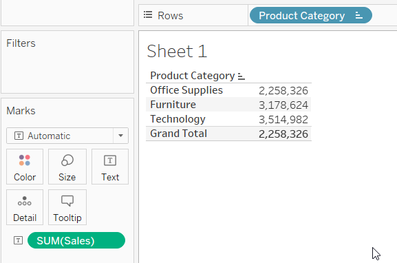
Correct Answer: Minimum -
"다음 뷰에서 선택된 '전체 사용' 옵션은 **최소값(Minimum)**입니다.
설명:
뷰에서 "Grand Total" 값이 2,258,326으로 표시되고 있습니다. 이는 Office Supplies(2,258,326), Furniture(3,178,624), Technology(3,514,982) 중 가장 작은 값과 일치합니다. 이 경우, 전체 값은 이 세 값 중 최소값을 사용하여 계산된 것입니다.
이는 "전체 사용" 옵션에서 최소값을 선택했을 때의 일반적인 동작입니다.
-
23. What steps can be used in creating a view with a reference line? [select two]Answer Provided: "분석 패널에서 참조선(Reference Line)을 클릭하고 뷰로 드래그합니다. 그런 다음 'Show Me' 메뉴에서 불릿 그래프(Bullet Graph)를 선택합니다."
Correct Answer: On the analytics pane, click on reference line and drag into the view., On the Show Me menu, select bullet graph - **참조선(Reference Line)**은 데이터 시각화에서 특정 값이나 기준을 나타내는 선을 추가하는 기능입니다. 이를 통해 데이터가 기준선과 어떻게 비교되는지 시각적으로 표현할 수 있습니다.
- **불릿 그래프(Bullet Graph)**는 하나의 값이 목표 값이나 범위와 어떻게 비교되는지를 보여주는 그래프 유형입니다. 성과나 목표를 시각적으로 한눈에 확인할 수 있는 효과적인 방법입니다.
-
24. What sort type should be used to have sort order Low, Medium, High?Answer Provided:No Answer Provided
Correct Answer: Manual
-
25. The most important items on a dashboard should be positioned where?Answer Provided:No Answer Provided
Correct Answer: Upper Left
-
26. You have a dashboard and you want to add a feature so that selecting an element on one of the worksheets on the dashboard causes a change on another worksheet in the same dashboard. What features will do this? (select all that apply)Answer Provided:No Answer Provided
Correct Answer: Filter Action, Highlight Action
-
27. What steps should you take to add a phone view to a dashboard?Answer Provided:No Answer Provided
Correct Answer: Select Device Preview, then select Phone for Device Type, then click the button labeled "Add Phone Layout"
-
28. You start with a blank worksheet and add a continuous field to the row shelf. How will this new field change your view?Answer Provided:No Answer Provided
Correct Answer: It will add a vertical axis
-
29. You have a scatter plot showing sales on the x-axis and profit on the y-axis, with each dot representing a different product subcategory. You want to show how the points on the scatter plot vary based on Net Profit, a third continuous variable. Which would be most appropriate? (Select all that apply)Answer Provided:No Answer Provided
Correct Answer: Size, Color
-
30. If you have bar chart with a single bar, but you want to subdivide that bar into multiple categories, what should you add to your view?Answer Provided:No Answer Provided
Correct Answer: A dimension
-
31. Which of the following fields will have AGG in front of it when you add it to the view?Answer Provided:No Answer Provided
Correct Answer: A calculated field with the formula SUM([Profit])
-
32. A histogram shows the distribution of ________ data by creating bins that are _________.Answer Provided:No Answer Provided
Correct Answer: continuous, discrete
-
33. Which of the following functions can be used on string to create a measure?Answer Provided:No Answer Provided
Correct Answer: COUNTD
-
34. If a continuous measure with all positive values is added to the Color area of the Marks card, what is the default?Answer Provided:No Answer Provided
Correct Answer: A sequential color gradient
-
35. Which option can be used to change only the font size the numeric values shown in the view below?Answer Provided:No Answer Provided

Correct Answer: Click Text on the Marks card
-
36. Which of the following visualizations allow you to set the shape of marks?Answer Provided:No Answer Provided
Correct Answer: Scatter plots, Symbol Maps, Circle views
-
37. Which of the following describes the effect of changing the filters for a sorted bar chart with sequential animation is turned on?Answer Provided:No Answer Provided
Correct Answer: The animation will show the bar sizes changing, then shows the bars reordering according to the sort
-
38. Which of the following will remove a legend on a dashboard? [select three]Answer Provided:No Answer Provided
Correct Answer: Click the x to remove it from the dashboard, Click the arrow on the legend and select “Remove from dashboard”, Select the legend by clicking and drag it out of the dashboard canvas
-
39. Which method can be used to replacing a worksheet in a dashboard with an different worksheet:Answer Provided:No Answer Provided
Correct Answer: Click the swap sheet icon next to the new worksheet on the dashboard pane
-
40. Which options can be used to export data as a CSV file? [select all that apply]Answer Provided:No Answer Provided
Correct Answer: On the Data Source page, select Data. Then select Export Data to CSV, Right-click the data source name in the data pane, then select “Export data to CSV”
24. Low, Medium, High 순서대로 정렬하려면 어떤 정렬 유형을 사용해야 하나요?
- 정답: 수동(Manual)
25. 대시보드에서 가장 중요한 항목은 어디에 배치해야 하나요?
- 정답: 왼쪽 상단(Upper Left)
26. 대시보드에서 한 워크시트의 요소를 선택할 때 다른 워크시트에서 변경이 일어나도록 기능을 추가하려면 어떤 기능을 사용해야 하나요? (모두 선택)
- 정답: 필터 액션(Filter Action), 하이라이트 액션(Highlight Action)
27. 대시보드에 전화 보기(Phone View)를 추가하려면 어떤 단계를 따라야 하나요?
- 정답: 장치 미리 보기(Select Device Preview)를 선택한 후, 장치 유형(Device Type)에서 전화(Phone)를 선택하고, "전화 레이아웃 추가(Add Phone Layout)" 버튼을 클릭합니다.
28. 빈 워크시트에서 연속 필드를 행 선반에 추가하면 뷰가 어떻게 변하나요?
- 정답: 세로 축이 추가됩니다.
29. X축에 판매액, Y축에 이익을 나타내는 산점도가 있고 각 점이 다른 제품 하위 카테고리를 나타냅니다. 세 번째 연속 변수인 순이익(Net Profit)을 기반으로 산점도에서 점들이 어떻게 변하는지 보여주고 싶습니다. 어떤 옵션이 가장 적합할까요? (모두 선택)
- 정답: 크기(Size), 색상(Color)
30. 하나의 막대 차트에 단일 막대가 있지만, 이 막대를 여러 카테고리로 세분화하고 싶을 때 뷰에 무엇을 추가해야 하나요?
- 정답: 차원(Dimension)
31. 뷰에 필드를 추가했을 때 앞에 AGG가 붙는 필드는 무엇인가요?
- 정답: SUM([Profit]) 공식이 포함된 계산된 필드
32. 히스토그램은 _______ 데이터를 _______로 구간을 나누어 분포를 표시합니다.
- 정답: 연속적인(Continuous), 이산적인(Discrete)
33. 문자열에 대해 측정값을 생성하는 데 사용할 수 있는 함수는 무엇인가요?
- 정답: COUNTD
34. 모든 값이 양수인 연속 측정값을 Marks 카드의 색상(Color) 영역에 추가하면 기본적으로 무엇이 설정되나요?
- 정답: 순차적인 색상 그라디언트(A sequential color gradient)
35. 아래 뷰에서 숫자 값의 글꼴 크기만 변경하려면 어떤 옵션을 사용해야 하나요?
- 정답: Marks 카드에서 텍스트(Text)를 클릭합니다.
36. 마크의 모양을 설정할 수 있는 시각화 유형은 무엇인가요?
- 정답: 산점도(Scatter plots), 심볼 맵(Symbol Maps), 원형 뷰(Circle views)
37. 순차 애니메이션이 켜져 있는 정렬된 막대 차트에서 필터를 변경하면 어떤 효과가 있나요?
- 정답: 애니메이션은 막대 크기가 변하는 것을 보여준 후, 정렬에 따라 막대가 재정렬되는 것을 보여줍니다.
38. 대시보드에서 범례를 제거하려면 어떤 방법을 사용해야 하나요? [세 가지 선택]
- 정답: 대시보드에서 범례를 제거하려면 x를 클릭, 범례에서 화살표를 클릭하고 "대시보드에서 제거(Remove from dashboard)" 선택, 범례를 클릭하고 대시보드 캔버스에서 끌어내기
39. 대시보드에서 워크시트를 다른 워크시트로 교체하려면 어떤 방법을 사용해야 하나요?
- 정답: 대시보드 패널에서 새 워크시트 옆의 교환 시트 아이콘(Swap Sheet Icon)을 클릭합니다.
40. 데이터를 CSV 파일로 내보내는 데 사용할 수 있는 옵션은 무엇인가요? [모두 선택]
- 정답: 데이터 소스 페이지에서 데이터(Data)를 선택한 후 "CSV로 데이터 내보내기(Export Data to CSV)" 선택, 데이터 패널에서 데이터 소스 이름을 마우스 오른쪽 버튼으로 클릭하고 "CSV로 데이터 내보내기(Export data to CSV)" 선택
'개인 프로젝트 > 데이터 분석 프로젝트' 카테고리의 다른 글
| [Tableau] BI 신병훈련 1일차 과제 (0) | 2025.01.11 |
|---|---|
| [BI] Tableau Specialist Exam 3 (0) | 2025.01.10 |
| [BI] Tableau Specialist Exam 2 (0) | 2025.01.10 |
| [BI] Tableau Desktop Specialist Study (0) | 2024.12.22 |
| [계산식] 구매전환율 retention(%) (0) | 2024.12.22 |


댓글